
Email marketing examples: Smart ideas to borrow for your own campaigns
It’s easy for marketers to get bogged down in A/B testing, click-through rates and other numbers and metrics. These are undoubtedly important tools, but creating high-performing emails isn’t all percentages and tests. There’s an art to it as well.
Just as artists study the masters, marketers can draw inspiration from other brands.
There are a handful of email marketing examples I keep coming back to again and again. Each of these emails showcases a specific aspect of email marketing, perfectly executed.
Here they are: six fantastic email marketing examples, plus take-aways you can use to spice up your own campaigns.
Chipotle’s textbook call to action
In this marketing email, Chipotle capitalizes on a trope about their brand: You usually have to pay extra for guacamole. Not so on National Avocado Day.
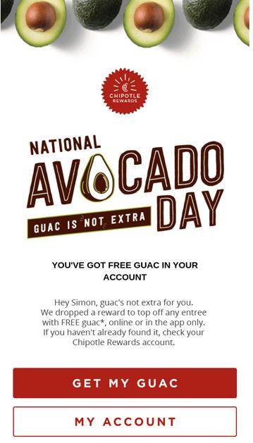
This email has a lot going for it. It’s focused. It’s tied to an occasion. I’m craving a burrito just reading it. But the real MVP is the call to action, one of the best I’ve ever seen.
Why it’s great
The ideal call to action is short, direct and explains the benefit to clicking. Get My Guac does all three – all while being playful and unique. That makes it stand out from the more standard calls to action we all see every day: Order Now, Read More, etc.
My only quibble: the double call to action buttons. Using just one is almost always better. By using color and placement to create a hierarchy, Chipotle at least makes choosing between them easier. The red button is clearly the primary CTA.
What to learn from it
Think carefully about every call to action. Before you reach for a go-to classic like Learn More or Shop Now, consider what the customer really gets out of clicking. Is there a more descriptive or pithy way to sum it up?
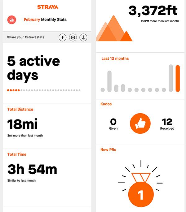
Strava gets personal with data insights
When it comes to email personalization, a lot of brands slap a name in their email subject lines and call it a day. Not the exercise tracker Strava. They go above and beyond every month with personalized data summaries.
Why it’s great
With detailed data insights in the app, the gamification of running and cycling are an essential part of the Strava brand. Stats overviews are a regular reminder that Strava is the place for all your workout data.
Every time users look back at a month of running or cycling, they feel happy and accomplished – and associate those feelings with Strava.
Many brands do this with an end-of-year wrap-up, but Strava’s monthly email cadence makes it all the more powerful. The effect is reinforced again and again throughout the year.
What to learn from it
Take a step back and think about the types of emails you’re sending. Consider what you’re uniquely positioned to offer customers that they’ll value. For some brands that might be industry expertise. For others, a sense of community, social responsibility or creative inspiration.
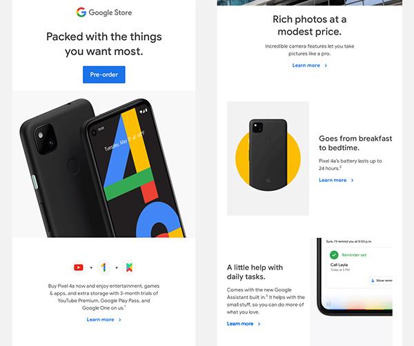
Google piques your curiosity
It’s always great to have a reason to email your customers, and a new product launch is the perfect opportunity. It’s current, it’s newsy and it shows off the latest and greatest a company has to offer. Google’s Pixel 4a announcement gets the news across while also making customers want to learn more – walking a fine line between too much information and not enough.
Why it’s great
Google gets the most important information out of the way with a straightforward subject line: Introducing the Pixel 4a.
You’d expect the email behind that subject line to show off the phone’s new features, but Google can’t cram them all into one email header. So they created a little mystery to keep customers reading.
‘Packed with the things you want most’ promises just enough to make customers want to see just what those features are. When they scroll down, they get a bite-sized pitch for each one.
What to learn from it
It’s good to be straightforward. But when you need to communicate lots at once, entice the customer to keep reading. There’s always space further down the email to spell things out more clearly.
Gobe stumbles and recovers
Mistakes happen. Fortunately, you can often save face with a graceful recovery. When camera accessory company Gobe triggered an email to their whole address book, they followed up with a little self-deprecating humor:
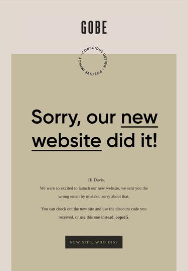
Why it’s great
In an age of perfectly calibrated and automated marketing emails, genuine interactions stand out. Even better, Gobe’s email is light and humorful, acknowledging the mistake without dampening the mood.
Not only did this approach smooth things over and humanize the brand, Gobe says it drove lots of traffic to their new website – and even converted to some sales.
What to learn from it
The message here is don’t panic! While I wouldn’t recommend it for a major scandal, a little humor and creativity can get you through most minor mishaps – and even make people like your brand more.
Rapha builds community
Marketing newsletters are hard to pull off. People don’t usually sit down to read marketing content over their morning cup of coffee. That’s why emails with just one topic usually perform better – they can be read and understood quickly.
So why is cycling apparel company Rapha – known for its sophisticated marketing – sending out long, old-fashioned email newsletters? The answer is simple: it’s about the brand, not the content.
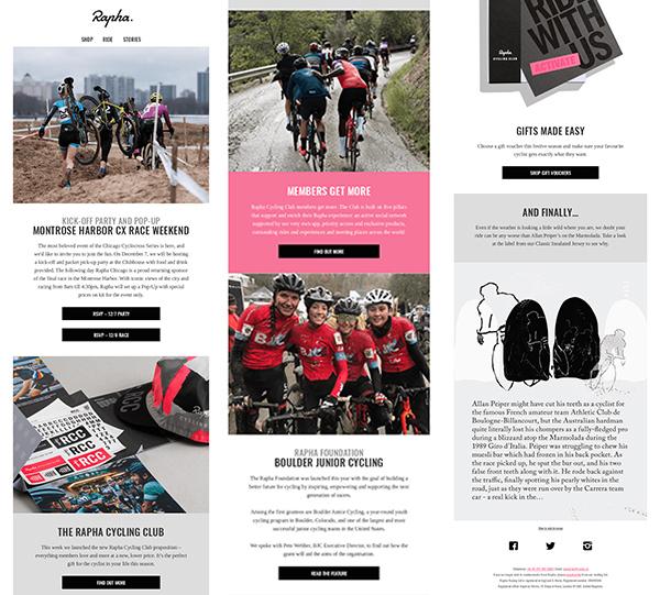
Why it’s great
Rapha’s overall brand strategy is to build a cycling community associated with their brand. They host rides and other events and promote their stores as places to hang out, not just shop.
The email newsletter contributes to that community feeling. It’s not just about selling cycling clothes. In fact, the email barely mentions the brand’s products at all. What matters is not that customers read the email, but rather that they see it in their inbox, and feel included.
The result: existing customers stay engaged between purchases, and new customers gravitate to the built-in community – and probably buy a few Rapha jerseys to fit in at those events.
What to learn from it
Not every email has to be designed to convert to a sale. Mix things up with campaigns that keep customers engaged. Build brand loyalty now, and you’ll reap the rewards for years to come.
Adobe lets loose (responsibly)
This email from Adobe is one of my favorite email marketing examples. Not only is it mesmerizing, it’s the perfect illustration for some of the most important email marketing best practices.
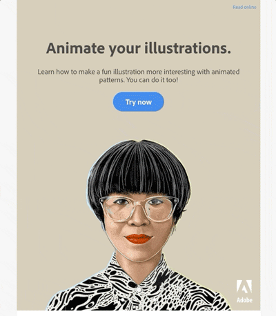
Why it’s great
Strategic whimsy – Gimmicks in email marketing can backfire, distracting from the message or turning customers off. In this case, however, the use of a flashy GIF makes sense. The animation amplifies the message rather than detracting from it.
Adobe’s marketing emails are usually pretty straightforward. But as this example shows, even the most buttoned-up brand can get let loose sometimes – as long as they stay on message.
Short, direct copy – Most people don’t read marketing emails in their entirety, so copy needs to get to the point. Adobe does just that with a straightforward headline and clear call to action.
A classic copy funnel – Once you know this email design technique, you’ll start to see it everywhere. A big, bold headline at the top, followed by explanatory text in a smaller font. Together they form a funnel shape that guides the eye straight to the call to action.
A human touch – Images with people in them give brands a human face. They can help connect with customers, especially if the person is making eye contact.
Adobe hasn’t picked just any person to represent their brand. She’s styled to appeal to a specific target audience: the creative types who use Adobe products.

Balance – This email is perfectly balanced. The flashy (literally!) illustration is offset by a drab beige background and minimal copy. It’s professional and playful – all at the same time.
What to learn from it
Don’t force whimsy, but don’t shy away from it either if the perfect opportunity comes along. Keep your emails short and to-the-point, and be strategic about email design choices.
Train yourself to appreciate great email marketing examples
Keep an eye out in your own inbox for genius ideas to borrow, adapt or even just appreciate. When you’re stuck in a rut, seeing smart marketing strategies come to life will help get back in touch with your creative side.
You could even curate your own collection of email marketing examples to refer to when you want a jolt of inspiration.
Let them motivate you to think outside the box about the types of emails you’re sending. Have a little fun with playful design and clever copy. You’ll boost performance in the short-term, and build meaningful associations with your brand over time.