
Designing emails: A guide to better performance and more conversions
What is email design?
Designing emails involves structuring, styling, and formatting email content to communicate a brand message and drive recipient action. It covers layout, typography, imagery, color, and calls to action, working together to improve readability and click-through rates. Effective email design balances brand consistency with performance-focused choices that guide readers toward a specific outcome.
Marketing resource management (MRM) combines tools and processes that enable marketing teams to plan, execute, and measure campaigns with greater efficiency.
Why email design matters
An unparalleled branding opportunity
With every campaign, your brand is beaming itself into customers’ homes, offices and pockets. Every aspect of every email contributes to an overall impression of your brand. That includes design choices.
Whether you’re working with existing templates or starting from scratch, it’s important to follow your company’s brand guidelines.
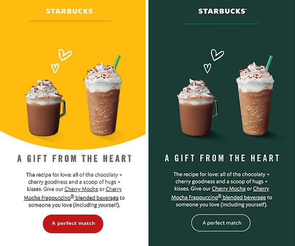
Which of the emails below looks like it came from Starbucks? Which do you trust more? When the design matches the brand, it just feels right.
Good email design improves conversions
Good design can improve email performance by:
- Catching the reader’s attention
- Not overwhelming the reader
- Guiding the eye to your call to action
- Reinforcing trust in your brand
Fortunately, you don’t have to choose between brand-focused and performance-focused design. The two can work together seamlessly.
How to customize email templates
If an in-house designer is building your email from scratch, it’s probably already on-brand. Be sure to thank your designer! If you’re working with a third-party template, however, you’ll want to make a few changes.
Add your logo
Your logo is your company’s most valuable brand asset. Make it clear who the email is from by placing it right at the top.
Use the right colors
You’ll probably need to change the template’s color scheme. Refer to your company’s brand guidelines to get the colors just right.
Web safe fonts vs. web fonts
To ensure your email looks good in every email client, you’ll need to choose a font that will display correctly.
Web safe fonts – The easy solution is to use a web safe font. Web safe fonts are common, near-universal fonts like Arial, Tahoma, Verdana and Times New Roman.
Web fonts – If your template offers more creative font choices, it’s probably using web fonts. Unlike web safe fonts, web fonts aren’t installed by default on every device and operating system.
Many email clients can display web fonts, but not all of them. So you’ll need to pick a web safe font as a backup. This is called a fallback font. Your email system will either automatically assign a fallback font or let you choose one. Be sure you test how your email looks with the fallback font too.
Check for mobile responsiveness
Make sure whatever template you build or customize is mobile responsive. This might seem obvious, but with 35-50% of emails read on mobile devices (depending on who’s counting), it’s too important not to mention.
Simplify. Then simplify more.
One email, one message
It will be easier to keep your design simple and straightforward if you’re not trying to say everything at once. Each email you send should have a single, clear message. Got a lot to say? Your content will likely perform better if you split it into multiple emails.
Keep it short
Chances are, you’re sending an email because you want customers to do something. Don’t make them work for it. They’re not going to scroll through four paragraphs and ten photos to find the link you’re promoting. Instead, keep things concise, so your most important content doesn’t get lost.
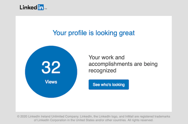
How short are we talking? Some brands really push the envelope in terms of minimalist emails. Take this one from LinkedIn:
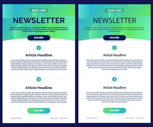
Most emails don’t need to take simple design to quite that extreme. But do take a hard look at every email you design, and see what you can cut. Simply removing some text makes this email much easier to digest:
How email design elements work together
You’ve been in the weeds, crafting perfect copy and finding just the right photos. But when your customer opens your email for the first time, they’ll be viewing it as a whole. All those elements you’ve lovingly created need to work together.
Next time you’re working on an email, go grab a coffee or a snack. When you get back to your desk, assess your design from a distance with fresh eyes.
Use plenty of white space
‘White’ space is the space around your text, photos and other design elements. Giving your content room to breathe will make it stand out, and make your email easier to read.
Get to the point
Most people won’t read your entire email. So decide exactly what you want customers to know, and get straight to the point.
Think of your email like a news article – you could just read the headline and still know what happened. The first sentence will spell it out a little more clearly. And if you’re truly interested, you can keep reading for the whole story.
Make important things big
It’s simple, but easy to forget when you’re all wrapped up in color schemes and font choices. Establish a hierarchy of what’s most important in your email, and make those things bigger.
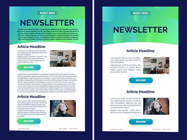
Use a single column
Emails formatted in a single column will look good on both desktop and mobile. Plus, they leave no question as to what to read first. A width of 600-640 px works best with most email clients.
Funnel to your call to action
With your most important content big and at the top, your email might look a little top heavy. This design is actually working in your favor, pointing right to your call to action.
This ‘funnel’ effect can come from an actual triangle shape, or just a feeling created by heavier elements at the top.
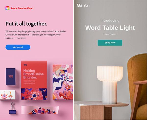
Strike the right balance between image and text
Most marketing emails will contain some combination of text and images. The right balance between the two will depend on what you want to say.
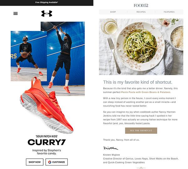
An email highlighting a new product design will want to show it off – cue some dazzling photos. An email teasing a blog post may require more text and use images in a supporting role.
Use images strategically
Humans are naturally drawn to images, and stunning photography and artwork will make customers want to read your email. Graphics and photos are a window to your brand – they convey personality and mood instantly, before the reader even gets to your copy.
Choose the right images
Complement your message
Is your email celebratory? Elegant? Calm? Images and copy should work together and tell the same story. And – you guessed it – match your brand identity.
Balance cohesion and variety
All the images in your email should look like they belong together. A jumbled mishmash of styles looks cluttered and can undercut your brand. That said, your images also shouldn’t look exactly the same. Mix things up with different angles, compositions and both narrow and wide crops.

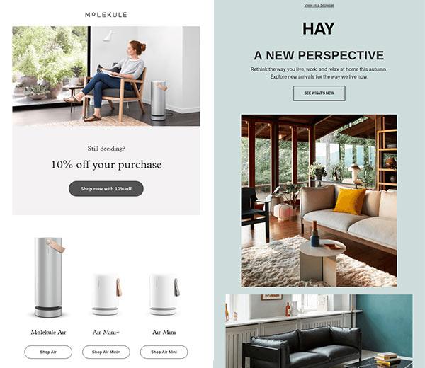
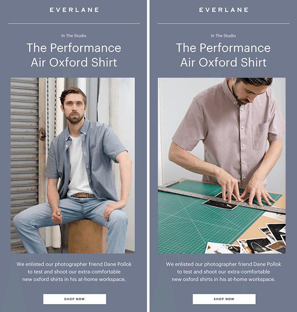
Use images with people. Or don’t.
Images with people in them give your brand a human face. They can help connect with customers, especially if the person in the photo is looking directly into the camera.
However, photos of people don’t work for all brands all the time. Sometimes you want customers to imagine themselves in the photo instead.
In the examples below, two brands take different approaches. Molekule gives customers someone to identify with, while Hay transports them into an empty room they can pretend is their own.
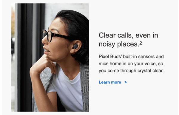
Direct attention towards your content
Whatever photos you choose, make sure any directional movement – a person’s line of sight, a moving train – is pointing towards your content, not out of the frame. In the example below, the eye doesn’t know what to do. Do you follow the woman’s gaze or read the copy?
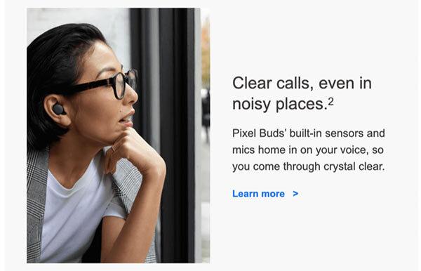
Flipping the photo around resolves the conflict. Her line of sight ushers you straight to the subheading.
Alternatives to photos
Photographs are a classic choice for email imagery, but you have other options too. Icons are a simple solution to anchor short snippets of copy, and custom illustrations in your brand’s color scheme can contribute to a more cohesive look.
GIFs are an option as well. There’s arguably nothing more attention grabbing than a flashing image. Used judiciously, they add fun and whimsy to your email design. Just be sure you watch your file size. Under 1 MB should get you where you need to be.
Design effective calls to action
Make CTAs stand out
Your call to action is the last thing you want to get lost in a cluttered email design. Design choices should make it clear where customers should click.
Button shape – Whether round corners or square, we’re all used to looking for certain button shapes in emails. Stick with a classic shape to avoid confusion.
Button size – Small screens require big buttons. To make things easy for mobile users, make your buttons finger-sized: at least 45 px tall.
Button color – A bright, contrasting color makes your CTA easy to find.
White space – A little empty space around your buttons makes them pop even more. Just don’t overdo it. Place buttons far enough from text that they stand out, but close enough that it’s clear what copy they belong to.
Explain the benefits first
The CTA button is an exception to the important-things-first rule. State your case before pushing customers to commit.
An ideal call to action is short, descriptive and explains how the action benefits the customer. This example from Chipotle checks all three boxes:
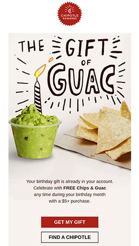
Sadly, many things in life are more complicated than free guacamole. If you can’t sum it up in two to three words, use descriptive text around the button to provide additional context.
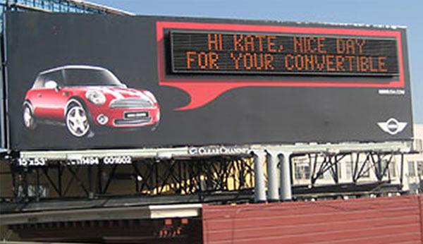
Make it personal
Voice, identity, persona – there’s a reason we talk about brands as if they were people. Every interaction helps build a personal relationship with customers.
You can’t design a custom billboard for every driver on the highway – though, remarkably, some have tried. Fortunately, personalizing emails is an easier (and less creepy) way to connect with your customers as individuals.
Ways to personalize emails
Addressing recipients by name is an obvious place to start. You’ve likely got plenty of other data about your customers that can help you personalize emails even more.
Gender – If you’ve ever bought clothes online, you’re probably now getting gendered marketing emails. Showing photos of menswear to men, and womenswear to women, is a classic way to personalize.
Purchase history – It’s no use trying to sell someone something they’ve already bought. However, not every email is designed to convert directly to a sale. In informational emails, seeing a product they already own can remind customers of their connection to your brand.
Age – You want your customer to identify with your photographs. If your customer base includes people of multiple ages, consider using different graphics for different age groups.
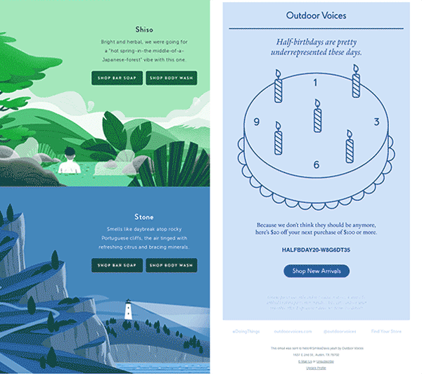
Highly personalized emails
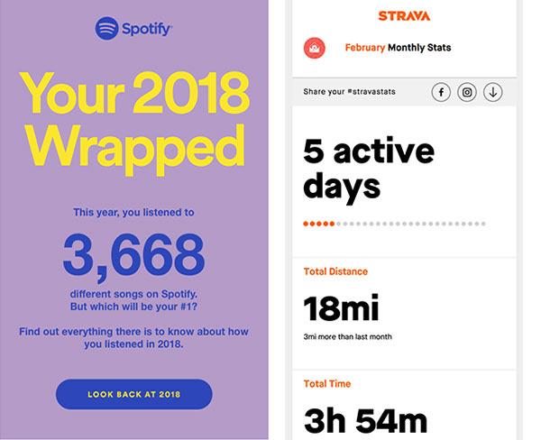
Emails designed around personalized data insights are especially engaging. A classic example is the end-of-year wrap-up. These emails evoke positive memories and remind customers of their journey with your product.
A/B test design elements
You’re probably already A/B testing email subject lines, but don’t forget to A/B test design elements too.
Pit two email formats against each other. See if one photo outperforms another. Compare click-through rates with different button colors.
Not only will you improve the performance of individual campaigns, you’ll collect valuable data with every email. Over time, these data points add up to tell you what works best for specific audiences.
It’s okay to bend the rules
This overview covers design principles that work in most circumstances. That doesn’t mean you should never push the envelope. Some of the best email campaigns are memorable and effective because they stand out. With a little imagination, you can stretch and adapt almost any design principle.
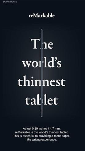
Normally you wouldn’t want to break up your headline text. However, this email graphic from ReMarkable makes its point because it does. Plus, the line of the tablet draws the eye down, just as the design element ‘funnel’ would.
Designing emails that compliment your overall brand strategy is more important than following any specific design rule. If you don’t have a comprehensive brand strategy already, our branding guide can help. If you do, you’re ready to get those creative juices flowing and design some killer emails.