
Email sign-up forms: Turn your web traffic into a thriving mailing list
Email sign-up forms are one of the best ways to build and maintain a healthy mailing list. But just having a form on your website isn’t always enough to entice people to sign up. Placement, design and copy all have a big impact on conversions.
By following a few best practices, you can turn a trickle of subscribers into a steady flow, so your mailing list keeps growing.
Where to put your email sign-up form
Your email sign-up form will be hosted somewhere on your website. Where exactly is up to you. You’ve got three main options: a dedicated email sign-up page, a field on an existing page (most likely the homepage) or a pop-up window.
We’ll go over each method in detail, so you can decide which works best for you.
A dedicated email sign-up page
Putting your sign-up form on its own page makes it easy to link directly to it. This helps convert customers who are active on other channels – like social media – into email subscribers. It also offers a bit more space if you need a longer form, but keep in mind that short forms usually perform better.
A form on an existing page
You can also simply embed your form on an existing page. That way, customers can stumble across it while they’re browsing and don’t have to navigate to another page to sign up.
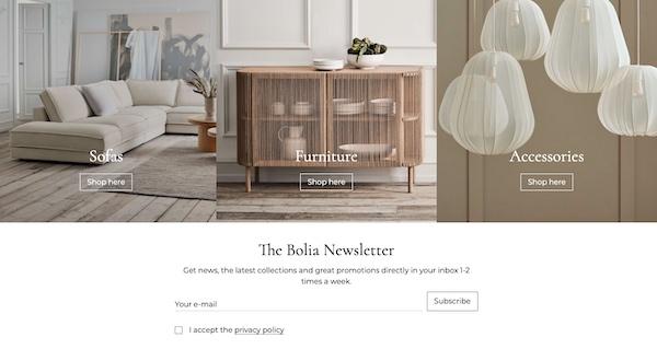
On the homepage – The most common page for inline email sign-up forms is the homepage. After all, that’s where most of your web traffic will initially land. Plus, customers on your homepage are likely in ‘exploration’ mode on your website, rather than looking for something specific. It’s the perfect opportunity to grab their attention.
On a sub-page – In some cases, it makes more sense to put your form on a sub-page – especially if your email marketing focuses on a specific kind of content. If you send out a regular digest of new blog articles, for example, you might embed the sign-up form underneath each blog post. That’s where you’re most likely to find people interested in that type of content.
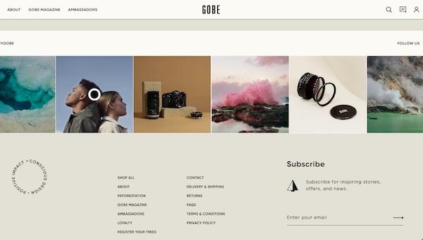
In the footer – An email sign-up form on your website’s footer appears on every page, providing the best of both worlds. The drawback is that this will often require a more subdued design, which visitors might overlook at the bottom of the page.
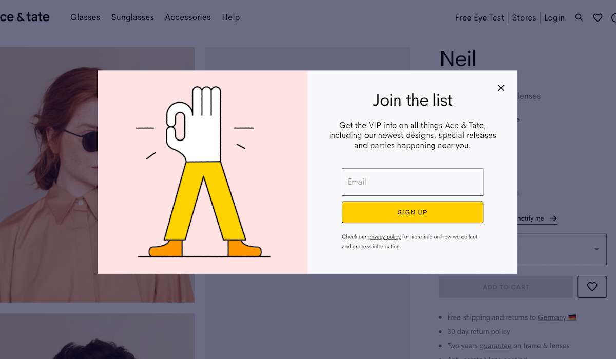
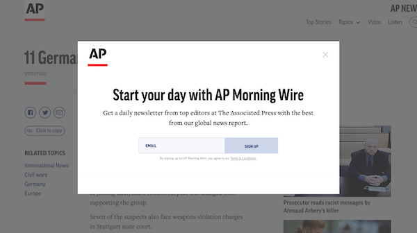
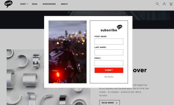
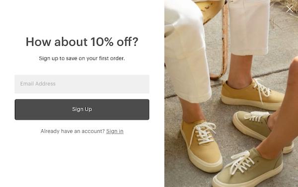
Pop-up forms
If growing your list of email subscribers is a top priority, a pop-up form is the way to go. Pop-ups convert much better than inline forms. They’re impossible to miss, and they force a response: either sign up, or close the window.
There are three main types of pop-up form:
Time delayed – Time delayed pop-ups appear after a user has been on the site a set amount of time.
Scroll delayed – Scroll delayed forms appear once a user has scrolled to a particular part of the page.
Exit intent – Exit intent forms appear when the user’s mouse movements signal they’re about to exit the page. That way, the request to sign up for emails doesn’t interrupt their browsing.
All three types ensure that the user isn’t accosted by a pop-up window as soon as they enter the site. Instead, they have time to take in what you have to offer before you ask them to give up their email address.
While they’re very effective, pop-up forms are a bit of a commitment and do carry some risk.
For one, they interfere with navigation on the site. You don’t want to interrupt a customer who’s about to purchase a product – you’ll get their email address anyway when they check out. Using exit intent forms is a great way to reduce this risk.
Another consideration: you may have other pop-up priorities. A pop-up prompting customers to create an account or book a demo might take precedence over an email sign-up form.
Combining methods
In many cases, it makes sense to have multiple ways customers can sign up for email updates. You could put a permanent email sign-up form in your website footer, for example, and augment it with a pop-up window you switch on and off as needed.
Decide how much information to collect
Once you’ve decided where to put your email sign-up form, you’ll need to determine which fields to include.
The simplest sign-up forms are often the most effective. After all, you’re asking your customers to do something. Don’t make them work for it! Only ask for the information you really need – just an email address is usually enough.
There are a few situations, however, when you might want a bit more:
Email segmentation – If you have an email segmentation strategy, sort your customers into segments when they sign up. Let’s say you’re a fashion retailer and want to market menswear to men and womenswear to women. A simple check box option on your email sign-up form makes that possible from the get-go.
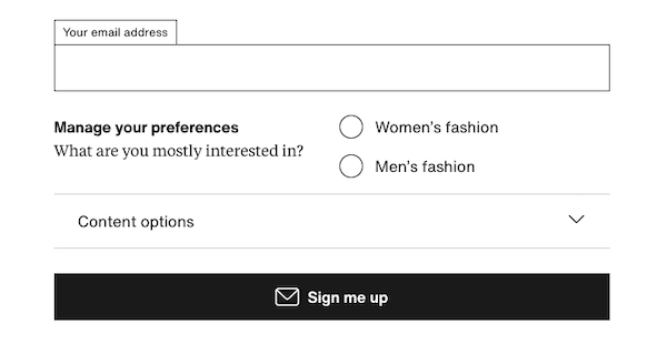
Getting the right kind of leads – Adding a few hurdles to your email sign-up filters out contacts you know will be a dead end. This is especially useful in B2B marketing. Forcing leads to provide a business email address, list a company affiliation or pick a job title from a drop-down menu discourages frivolous, low-quality sign-ups.
Collecting marketing data – Email sign-up forms are also an opportunity to collect data about people interested in your products, like their location, or how they learned about you. But remember, creating more work for customers results in fewer email sign-ups. So weigh the benefits against the costs.
State your case with clear, clever copy
In an era of overflowing inboxes, people won’t give their email contact information up to just anyone who asks. You have to make a convincing case.
Keep these best practices in mind writing email sign-up form copy.
Offer something of value
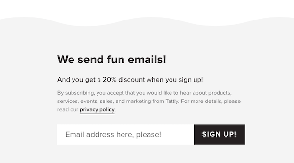
One highly effective method of getting people to sign up for email marketing is to offer a discount code or other incentive. Or maybe being on your mailing list means customers get first dibs on tickets, exclusive deals or members-only access to popular content.

Let people know what to expect
People want to know what they’re signing up for. Explain what types of emails you send, and how often you send them.
Find a clever way to say it
Customers read the words ‘sign up for our newsletter’ on nearly every site they visit. The word ‘newsletter’ doesn’t sound particularly exciting, and because customers see it all the time, it doesn’t stand out. If you can, find a direct but creative way to tell people what your form is for. Let your brand’s voice shine through to cut through the clutter and remind customers of your personality.
Keep it short
The biggest challenge of writing copy for email sign-up forms is conveying all that information at a glance. Try to keep your copy as brief and informative as possible. Your goal is a smooth, seamless experience in which the customer sees the form, and immediately understands the benefits of signing up.
Use design strategically
A good-looking sign-up form helps make your marketing emails look appealing. People will want to receive creative emails, and the sign-up form is a preview of what they can expect. What’s more, strategic design choices boosts a sign-up form’s performance. Here are some basic design principles to keep in mind.
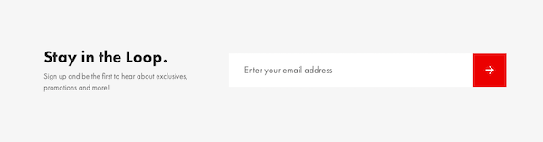
Use bright, contrasting colors
A visually appealing sign-up form will draw people’s attention. This is especially helpful with inline forms, though it also doesn’t hurt to give pop-ups a little extra pop.
Consider the whole page
Make sure your form fits into your page design. Not everything on a webpage can be important. If everything is big and bright, the page will become too cluttered and confusing. If you have other content you need to prioritize, you might have to compromise on a more subdued sign-up form design.
Use different font sizes
A font size hierarchy lets you grab people’s attention with a catchy headline, and then seal the deal by providing more details below. You shouldn’t have much copy in your sign-up form to begin with, but using two font sizes allows for a bit more information, while keeping your message easy to digest.
Use images that complement your message
Images are optional, but they’re a great way to catch people’s attention and reinforce your message. A strategically selected photo or illustration reminds people what they’re getting if they sign up: attractive products and an appealing brand experience.
Think beyond email sign-up forms
Email sign-up forms are the most obvious way to gather customers’ email addresses, but they aren’t your only option.
You also collect customers’ email addresses in the course of doing business, like when they create an account or shop in an online store. Even brick-and-mortar stores can integrate email into their workflow, with online appointment booking or by offering to email customers their receipts.
Whatever methods you use, the main thing is to never stop growing your list. The beauty of email marketing is that the more high-quality contacts you accumulate, the more people you reach with the same amount of effort.