Find your brand soul: 9 inspirational brand style guide examples

As more and more brands see the benefits of brand style guides, the demand for accurate and complex guides is growing. But with so much ground to cover, it can be hard to know where to start. The best way to build a brand style guide is to have clear examples to follow for inspiration and structural guidance.

This article provides eleven of the most helpful examples of brand style guides you’ll find. I’ve selected each one based on its merit as a standout guide.
What is a brand style guide?
A brand style guide is a brand document that details the correct settings for all branding elements, like themes, logos, color schemes and language. It gives users specific instructions and examples, which make it easy for employees to follow organizational standards.
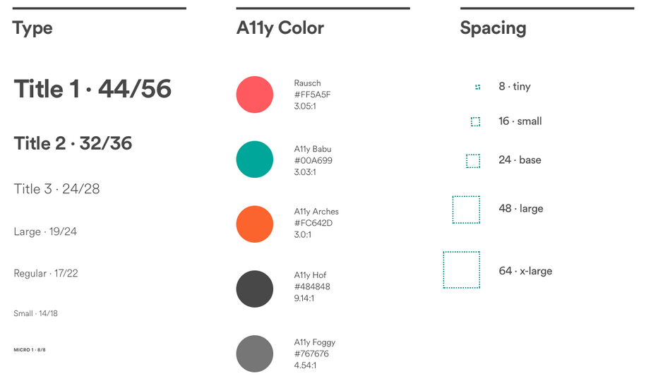
Design
Most style guides provide details about which types of fonts to use. These are usually different throughout different projects and platforms.

Brand style guides will inform users of the types of color schemes that are used and what options for colors are possible for future projects and campaigns.
Grammar and language
There are going to be certain grammatical rules each brand is comfortable with, which they’ll have inside their style guide. They’ll also include the type of language, including the voice and tone of content.
Now that you know what a brand style guide is, let’s look at some helpful examples.
For more branding ideas, check out my comprehensive branding guide.
9 examples of brilliant brand style guides
I’ve selected the following eleven brand style guides based on their own unique functionality.
1. Chess.com

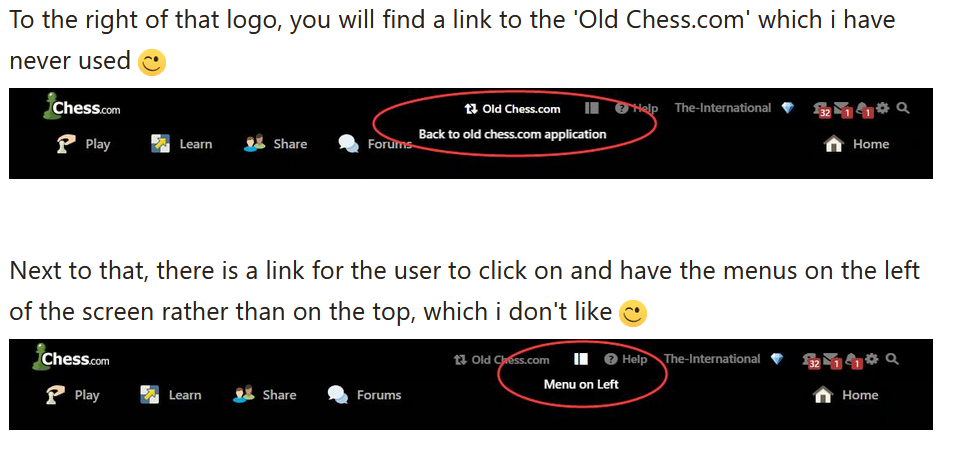
The main focus of this style guide: Chess.com is on a mission to change the way humans play the game of chess. Their style guide focuses on the experience of each game in the eyes of customers/users, ensuring that the correct game format is placed in the right section of their playing area. This notifies everyone that they’re in the right place at all times on the website.
What makes it unique: This is one of the first style guides I’ve seen that details brand elements and resources based on not only having the correct visuals in place, but also making certain users are given the right information about a product variant in a niche industry.
2. Alienware
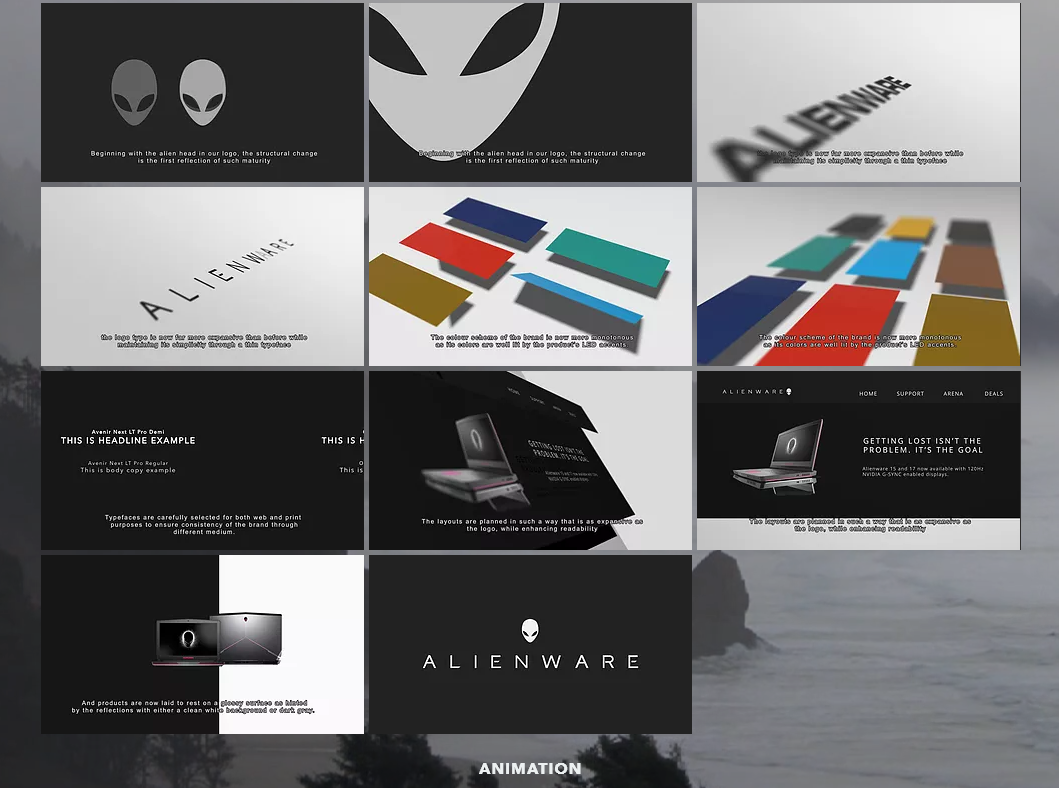

The main focus of this style guide: Alienware’s computer systems have a special twist to each product. Their style guide details different music/sounds, layouts and animations. The guide gives detailed descriptions of each element, as well as examples when needed (animations, videos, etc.).
What makes it unique: Alienware’s style guide is almost an accomplishment on its own, as it is one of the most stylish, unique and beautiful digital prints out there. The entire layout and color scheme is inviting and gives anyone reading it a baseline idea of what Alienware is all about.
3. Cisco

The main focus of this style guide: Cisco is on the forefront of digital security solutions. Their guide not only gives ideas into the correct way to use their branding elements, it also informs users of how the Cisco brand should be handled in terms of values and ideals.
What makes it unique: Cisco’s brand style guide tells a story, page-by-page, with a creative layout that is interactive, informative and fun. They’ve clearly decided that a traditional style guide just wouldn’t cut it with their goals and ideas about how a brand should be run.
4. Mozilla Firefox
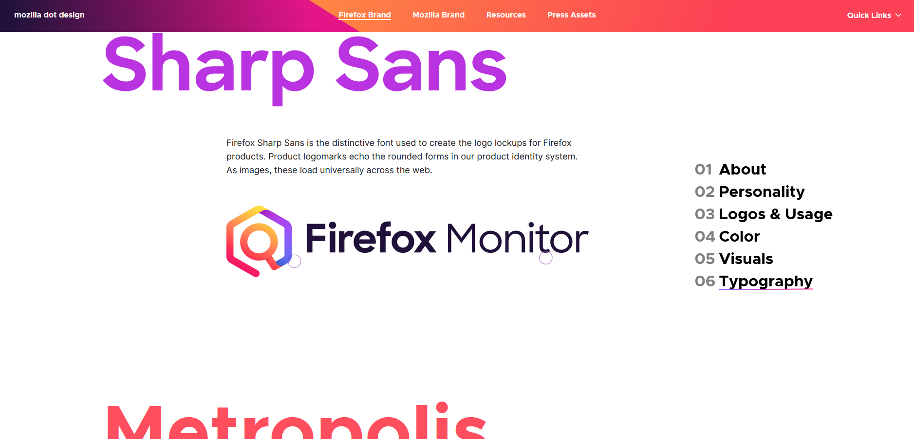
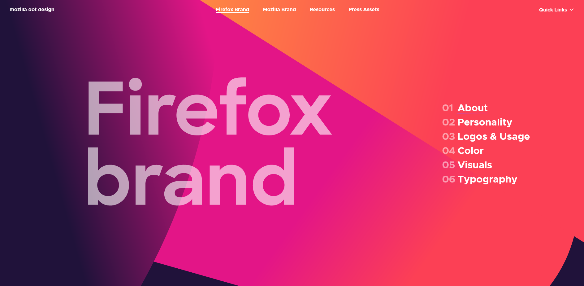
The main focus of this style guide: Firefox is an ever-evolving web browser that prides itself on updating its features whenever possible. Its style guide is focused on detailing their unique services, ideals and personality.
What makes it unique: Besides from the beautiful color scheme of the guide, I think the most interesting thing about the guide is its simple navigational system. Even though most guides aren’t too big, they can still be a hassle to get around inside. Mozilla’s style guide made sure users could find aspects they wanted immediately.
5. Netflix
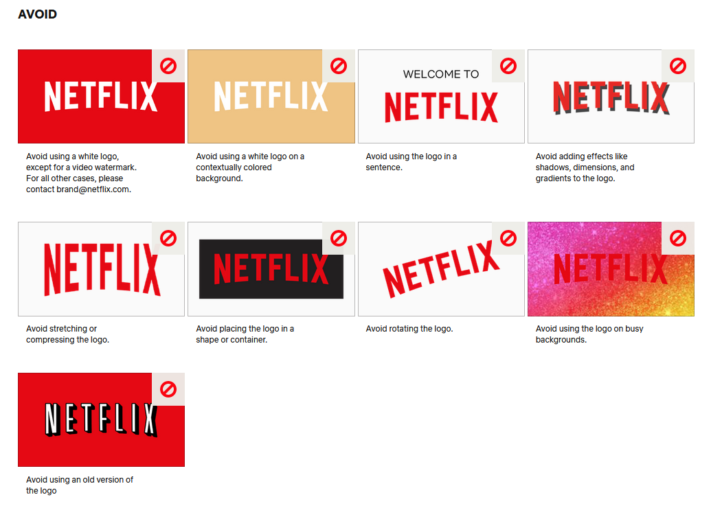
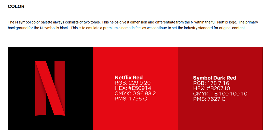
The main focus of this style guide: Netflix is at the forefront of the media streaming industry. Their guide ensures that no mistakes are made by giving extensive details, both on what to do and what to avoid concerning their brand elements.
What makes it unique: The details are extremely specific, it is as if Netflix covered every possible scenario in which a branding element could be misused or misplaced. There is a comforting feeling that accompanies having this level of detail, since it’s unlikely anyone is unsure of how to handle a particular element.
6. Mailchimp
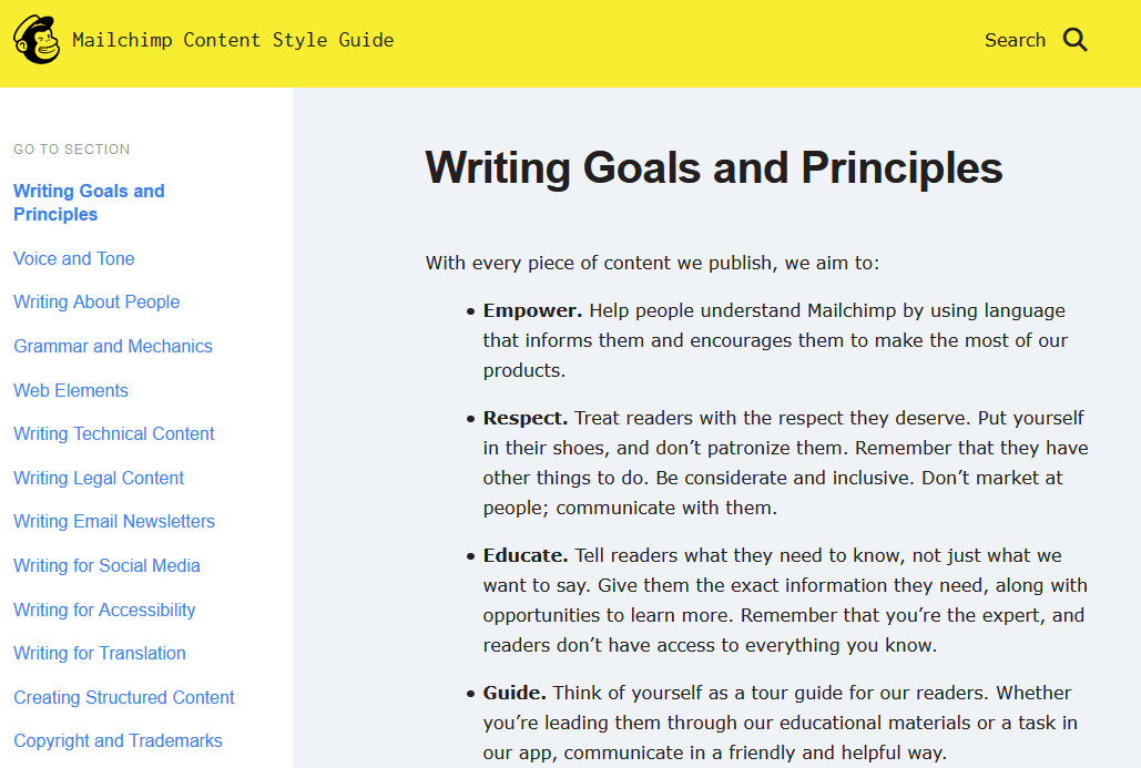
The main focus of this style guide: Mailchimp concerns itself with delivering helpful email marketing software to all different types of brands. Their style guide handles mostly the different types of writing, voice, tone and language used. This also includes how to write different categories of content.
What makes it unique: Mailchimp gives detailed instruction on writing, but what makes it extra unique is its inclusion of different goals and ideals into the guide. This just isn’t the case for many brands, and its inclusion guides users for all future projects.
7. Airbnb

The main focus of this style guide: Airbnb thrives to give a new meaning to vacations. Its style guide has an extremely technical focus, giving deep detail for each specific element or situation which might arise during a campaign.
What makes it unique: Airbnb took a different angle with their style guide, treating it almost like a story or a language-heavy technical manual. It offers instructions, but these are minimal compared to the details it gives throughout in its paragraphs scattered throughout.
8. Apple
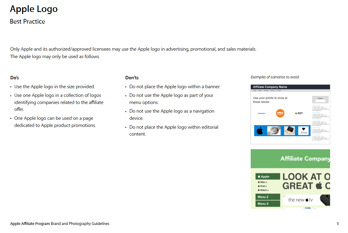
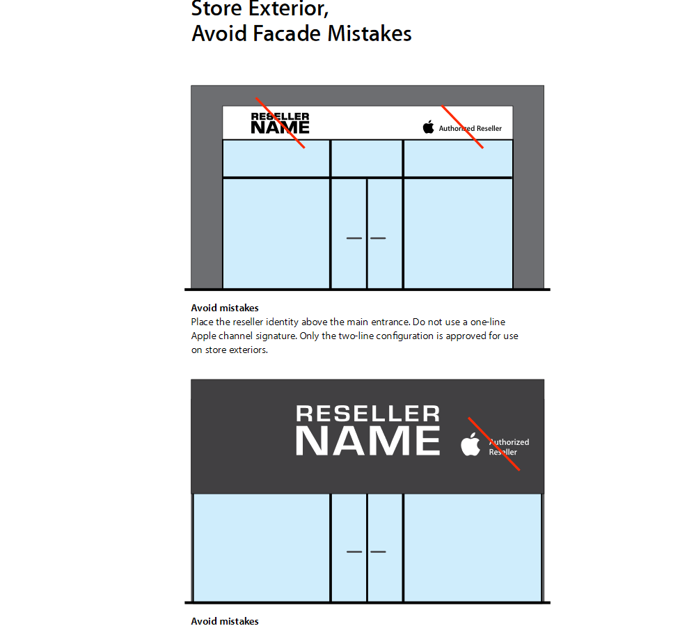
The main focus of this style guide: Apple pushes the envelope in terms of technological advances. Their style guide(s) are lengthy, which is resolved by dividing them into different sections that are specific to the topic. For example, there is a separate style guide for both digital visual elements and physical store requirements.
What makes it unique: Besides the length of these guides, the thing that stands out the most is the helpful images which accompany each potential issue. Apple made sure that no one would be unsure of what certain text meant, by including extremely instructive and helpful photos next to sections.
9. Foursquare
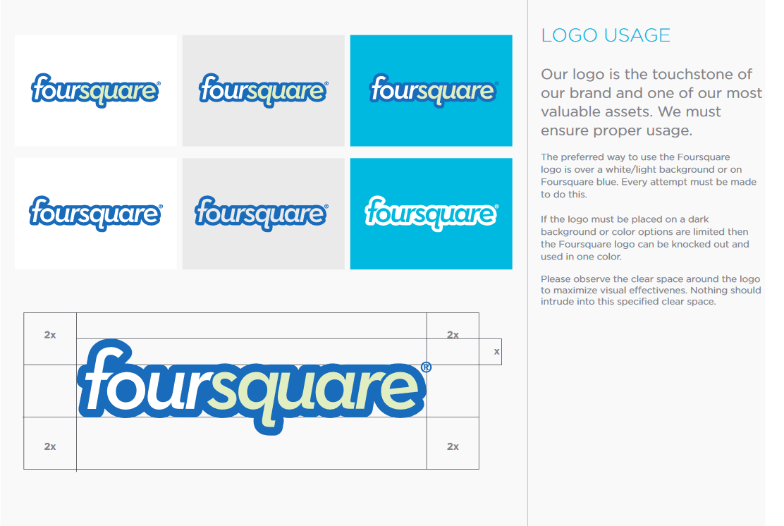
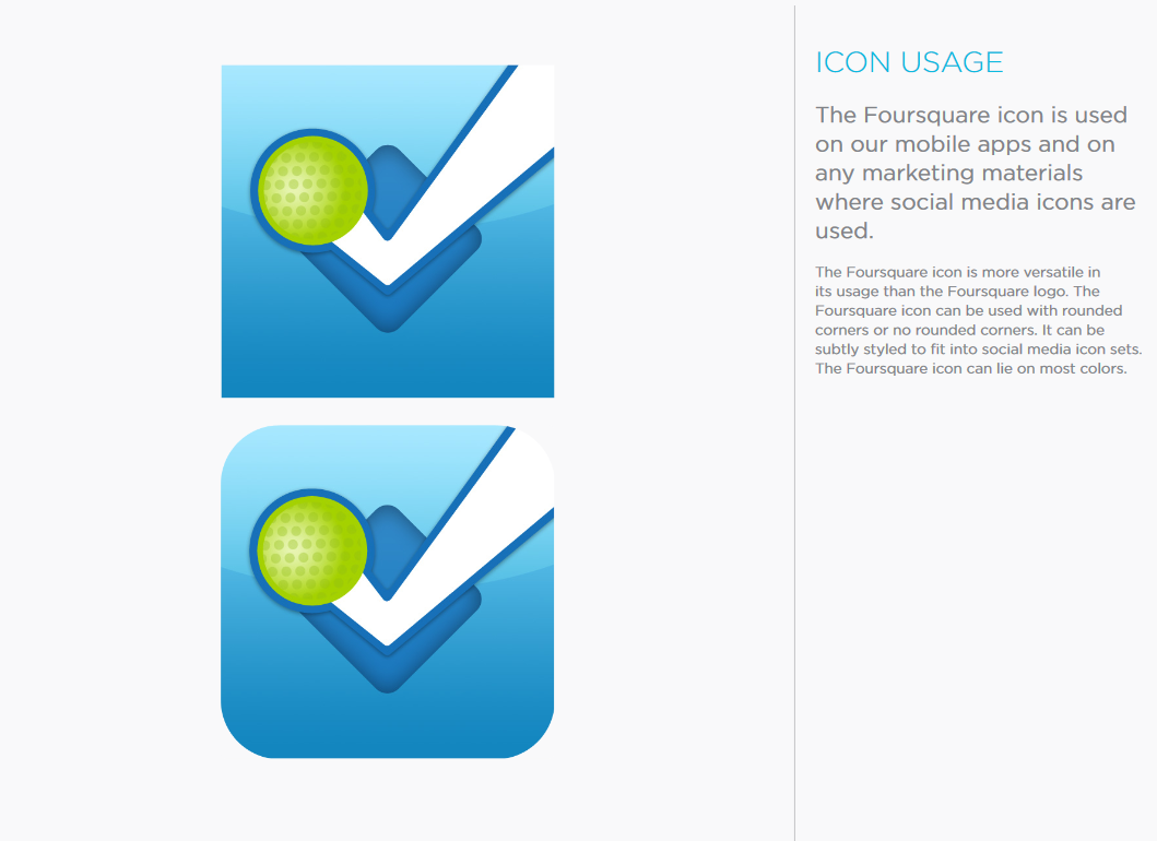
The main focus of this style guide: Foursquare is a leader in geographic data maintenance. Their style guide is very visual, giving users detailed instructions on how to use visual elements such as logos.
What makes it unique: This guide’s simplicity is what I like best about it. Foursquare has managed to include all relevant details in an easy-to-follow manner, each page guiding readers to the specific information they need with nothing extra.
Final thoughts
Now that you have a good idea of what types of guides worked for other brands, begin to come up with ways to differentiate in your own way.
Chances are you’ll be able to use these examples as a jumping off point to something fantastic.